

A Matplotlib Reference

Many of my articles use Matplotlib and I usually include a brief overview of the library, its installation process and basic usage. To avoid the necessity of repeating this in every article I have written this short introductory guide to serve as a general reference for all my projects using Matplotlib.
What is Matplotlib?
Matplotlib is a Python library which generates a wide range of graphs, charts and data visualisations. Its best known use is within data science but I generally use it for more mathematical purposes which is what the example in this reference will concentrate on.
Installing Matplotlib
You can install Matplotlib quickly and easily with pip:
pip install matplotlib
This is its page on PyPI, the Python Package Index.
https://pypi.org/project/matplotlib/
Plotting a Mathematical Function
The code below creates values for the function y = x² for a range of values of x and then plots the results using Matplotlib. This is a rather specialised and atypical use of Matplotlib which is more often used for creating bar graphs, pie charts etc. from data. However, as I mentioned above this code is typical of the way I use Matplotlib and this article is intended as a reference for my own projects.
This code uses NumPy so if you're not familiar with that you might like to look at my NumPy reference.
import numpy as np
import matplotlib.pyplot as plt


def main():

    x = np.arange(-16,17,1)
    y = x**2

    print(x)
    print(y)

    plt.plot(x,
             y,
             label='y = x2',
             color='#FF8000')

    plt.xlabel("x")
    plt.ylabel("y")
    plt.title("Quadratic")
    plt.legend()
    plt.grid(True)

    plt.show()


if __name__ == "__main__":

    main()
Firstly a couple of imports, numpy and matplotlib.pyplot, which are aliased as np and plt by convention.
In main we create a NumPy array of x values from -16 to 16, and then another array of y values by squaring the x values. These are then printed just to give a visual indication that the process has worked.
Now comes the interesting Matplotlib stuff. One of matplotlib.pyplot's many methods is simply called plot and creates a line graph from the supplied x and y values. (They don't need to be called x and y of course, they are just the logical names to use in this context.) The plot method has many optional parameters and here I have just used two as this is a minimalist example. label is used in the legend and color is the color of the line which by default is blue, or to be precise #1F77B4. (There are actually ten default colours which are cycled through if you add more than one line to a plot.)
Next a bit of cosmetic formatting. The axis label texts are set, as is the plot title, and then the legend and grid lines switched on.
Finally we call plt.show() which, believe it or not, shows the plot. The plot isn't shown immediately it is created as we may want to add further plots and, as here, set a few other options.
If you run the code you'll see this.
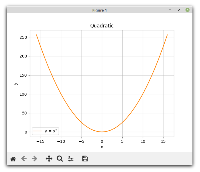
You might like to spend a moment playing with the buttons at the bottom, and you can resize or maximise the window in the usual way.
In just a few lines of code we have created values from a mathematical function and generated a smart and professional looking graph from those values. And this example only shows uses very basic Matplotlib functionality; there are many more options just for plot, as well as a wide selection of different types of graph and chart.
Further Information
If you want to investigate Matplotlib's capabilities further the official documentation is comprehensive and well written. Just head over to: