Exploring the Visible Spectrum with Python Part 2

This is the second part of my two-part series on the visible spectrum. In the first part I created and printed a data structure containing wavelengths, frequencies and energies of the various colours of visible light, as well as the equivalent red/green/blue values. In this part I'll create a couple of graphs using Matplotlib to show the data. If you haven't already done so please read Part 1 before reading this article.
The source code for both articles is in the GitHub repository.
What to Plot?
There are three sets of data calculated for this project, wavelengths, frequencies and energies, so there are a number of different combinations which we could plot. I have chosen to plot wavelengths against frequencies, and wavelengths against energies, both with wavelengths on the x-axis. If you want to plot a different combination of data it's pretty easy to do. You could even plot all three data sets on one graph with the y-axis representing two different scales, one labelled on the left and the other labelled on the right.
The Code
I've already described vsdata.py which creates the data, and the part of vsoutput.py which prints the data in the terminal. This is vsoutput.py in full, including the two Matplotlib functions.
from typing import Dict

import matplotlib
import matplotlib.pyplot as plt


def to_console(data: Dict) -> None:

    """
    Prints the data structure returned by
    vsdata.generate_data in a table format.
    """

    heading = f"| {chr(955)}(nm) | f(THz) |    E(J)    |  R  |  G  |  B  |"

    print("-" * len(heading))
    print(heading)
    print("-" * len(heading))

    for i in range(0, len(data['nm'])):

        print(f"| {data['nm'][i]:>5.0f} |", end="")
        print(f" {data['THz'][i]:>6.0f} |", end="")
        print(f" {data['Jsnsig'][i]:>4.2f}x10⁻¹⁹ |", end="")

        print(f" {data['rgb'][0][i]:>3.0f} |", end="")
        print(f" {data['rgb'][1][i]:>3.0f} |", end="")
        print(f" {data['rgb'][2][i]:>3.0f} |")

    print("-" * len(heading))


def plot_wavelengths_frequencies(data: Dict) -> None:

    """
    Plots vsdata.generate_data dictionary with
    wavelengths on x-axis and frequencies on y-axis.
    """

    plt.bar(x = data["nm"], height = 1000, width=1.0, color=data["rgbtuples"])

    plt.plot(data["nm"],
             data["THz"],
             linestyle="-",
             linewidth=1.0,
             color='#000000')

    plt.title('Wavelengths and Frequencies of Visible Light')

    plt.xlabel("Wavelengths in Nanometres")
    plt.ylabel("Frequencies in Terahertz")
    plt.margins(x=0, y=0)
    plt.grid(True, color='#000000')

    plt.show()


def plot_wavelengths_energies(data: Dict) -> None:

    """
    Plots vsdata.generate_data dictionary with
    wavelengths on x-axis and energies on y-axis.
    """

    plt.bar(x = data["nm"], height = 10, width=1.0, color=data["rgbtuples"])

    plt.plot(data["nm"],
             data["Jsnsig"],
             linestyle="-",
             linewidth=2.0,
             color='#000000')

    plt.title('Wavelengths and Energies of Visible Light')

    # causes nanometres to run in descending
    # order so that energies are in ascending order
    plt.gca().invert_xaxis()

    plt.xlabel("Wavelengths in Nanometres")
    plt.ylabel("Energies in Joules x 10⁻¹⁹")
    plt.margins(x=0, y=0)
    plt.grid(True, color='#000000')

    plt.show()
plot_wavelengths_frequencies
Even if you haven't used Matplotlib before the code in this and the next section should be easy to follow, being no more than a succession of calls to various matplotlib.pyplot (as plt) methods.
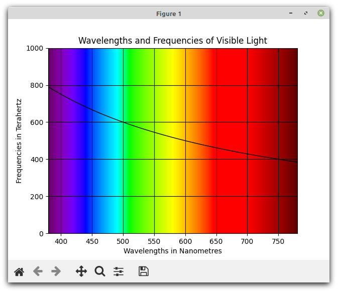
The first line creates a bar graph but I have subverted this functionality somewhat to draw a coloured background with each bar having a constant height and width (1000 and 1 respectively), the data on the x-axis being the wavelengths, and the colour tuples being used for bar colours.
The next line is a more conventional use of Matplotlib: to plot actual data. The first two arguments to plot are the x-axis and y-axis data sets, the next three being the formatting of the line.
The next five lines just set items of text and the general appearance of the plot. It's necessary to set the margins as by default Matplotlib leaves a bit of extra space around the sides which I felt wasn't suitable for these plots.
Finally we call show() to generate and display the plot.
plot_wavelengths_energies
This function is largely the same as the previous but it displays energies (Jsnsig) on the y-axis. Remember that these are the significands of the joules values to 10⁻¹⁹, which is shown as the y-axis label.
The only unusual point of note about this code is that the x-axis is reversed using plt.gca().invert_xaxis(), something you may not have needed to do before even if you are a regular Matplotlib user.
This is vsdemo.py.
import vsdata
import vsoutput


def main():

    data = vsdata.generate_data(interval=8)

    vsoutput.to_console(data)

    # vsoutput.plot_wavelengths_frequencies(data)

    # vsoutput.plot_wavelengths_energies(data)


if __name__ == "__main__":

    main()
The vsdemo.py is that used in Part 1, although for this project you'll need to comment out vsoutput.to_console(data) and uncomment the next two lines. Also, change the interval argument in the first line of main to 1 or the data on the graphs will be very sparse.
Running the Program
Run the program like this:
python3 vsdemo.py
The graphic above shows the output of plot_wavelengths_frequencies. Note that as the wavelengths increase on the x-axis the black line showing the frequencies decreases. When running in Matplotlib you can resize the window, zoom in and out, and mouseover the actual plot to see individual value pairs. You can also click the save icon to save the plot as a png file.
Here we have the graph from plot_wavelengths_energies. As mentioned above the order of the x-axis is reversed so that as wavelengths decrease to the right the energies increase.
Conclusion
I think the plots produced by this code give a striking visual impression of the numbers which underlie the familiar colours which we see all the time. If you wish to plot some other combination please go ahead. You might like to fork the Github repo, and let me know in the comments.


